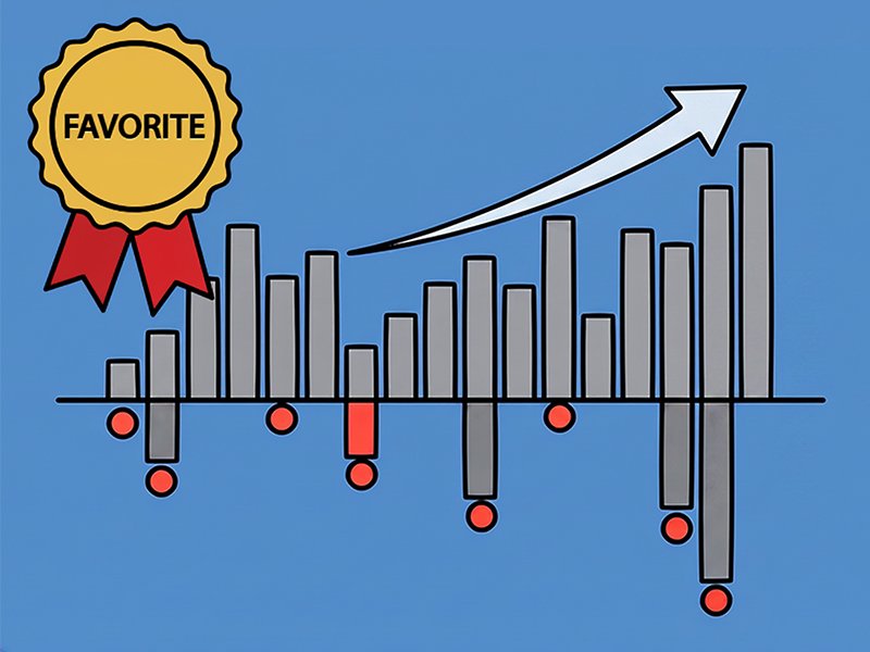
At NTX Wealth Partners, there’s one investing chart we keep coming back to with clients. Not because it’s flashy, but because it’s helpful. We call it “The Red Dot Chart,” and it has earned its spot in the conversation.
This chart does three things better than almost anything else we’ve seen:
- shows how volatile the stock market really is
- shows how often the market recovers even after scary drops
- reminds investors why long-term investing is about decades, not months
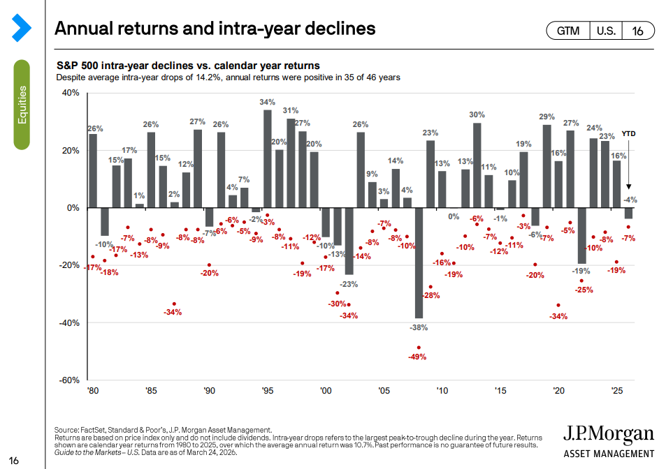
What the chart shows (plain English)
The chart is simple:
- Gray bars show the market’s full-year return each year
- Red dots show the worst drop that happened during that same year
The red dots are the reason we love it. They’re a quick reminder that the market does not move in a straight line, even in years that finish well.
Why this matters if you’re 5–10 years from retirement
As retirement gets closer, volatility can feel personal. A market drop is no longer just a headline. It can feel like a threat to your income plan, your withdrawal strategy, and your timeline.
That is why we build plans that do not rely on perfect timing. A few guardrails we focus on:
- keep a cash and short-term bond buffer so you’re not forced to sell stocks in a downturn to fund spending
- stick to a target allocation we can rebalance back to instead of guessing what the market will do next
- use a withdrawal strategy built to handle normal corrections, not just best-case markets
The goal is not to eliminate volatility. The goal is to make sure volatility does not force bad decisions.
Lesson #1: The market drops 10% or more more often than most investors think
A 10% market correction sounds dramatic until you realize it is common. Over the past 45 years, the average intra-year decline has been over 14%.
A drop of 10% or more has happened in more than half of those years. That does not mean something is broken. It means volatility is a normal part of investing. This matters because most investor mistakes do not happen in the long-term plan. They happen in the short-term panic.
Lesson #2: Mid-year declines often do not tell you how the year will end
One of the best reminders in the chart is that many years with ugly red dots still finish with positive gray bars.
The path is messy, but the long-term trend has historically been rewarding. That is why “I’m going to wait until things feel better” usually backfires. Markets tend to recover before the headlines do.
Lesson #3: Long-term results can still be excellent despite frequent pullbacks
Despite the average annual pullback of over 14%, the market’s long-term annualized return over the past 45 years has been about 10.7%.
That combination is the whole lesson:
- volatility is the price of admission
- compounding is the reward for staying invested
I also remember 1980. Great year for markets. Different era, same lesson: the ride has never been smooth, but patient investors have historically been rewarded.
Bonus: dips can create smart tax-planning opportunities
Market declines can create opportunities, especially in the years after retirement and before RMDs and Social Security fully kick in.
Depending on your situation, we may look at:
- Roth conversions when account values are temporarily lower, which can mean paying tax on a smaller number and letting a potential recovery happen inside the Roth
- tax-loss harvesting in taxable accounts
- bracket management so we fill a tax bracket on purpose instead of stumbling into a higher one later
Bottom line
The Red Dot Chart is our favorite because it tells the truth:
- the market drops 10% or more frequently
- those drops are a normal part of investing, not a sign your plan is broken
- over long periods, the market has historically rewarded patient investors anyway
If your plan is built correctly, those red dots become background noise and potential opportunities, not a reason to bail.
Want help applying this to your plan?
If you’re staring down retirement or RMDs and want a clearer strategy around risk, withdrawals, and Roth conversions, let’s talk. We’ll help you pressure test your plan and see whether there’s a smart way to improve your long-term after-tax outcome.
Investing involves risk, including the potential loss of principal. Past performance is not a guarantee of future results. Roth conversions have tax implications and may not be suitable for everyone. Please coordinate with your tax professional regarding your specific situation.